What an AI's memory actually looks like
The knowledge-graph screenshots that go round on social media are suspiciously beautiful: symmetric, evenly spaced, colour-coded by folder. A real vector memory looks nothing like that. Here is what the shape actually is, and what it took to draw it honestly: a metric for messiness, a palette borrowed from stellar astronomy, and a renderer whose best trick is drawing nothing at all.
The tell
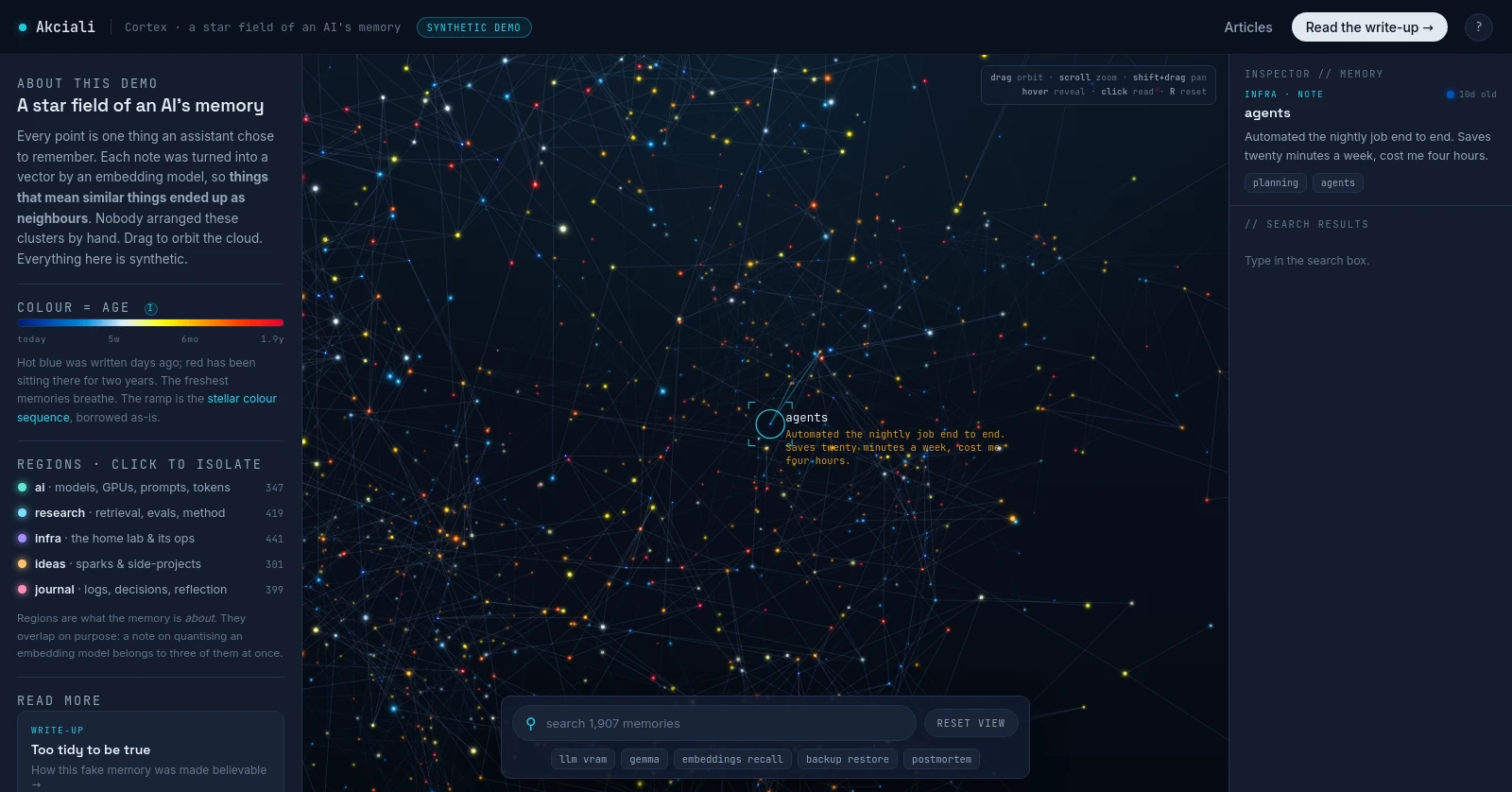
A while ago I turned an AI assistant’s memory into a 3D star map: every note a point, position meaning similarity, colour meaning age. The public demo of it has always run on entirely invented data, for the obvious reason. The real memory is mine, and a public URL is not where it belongs.
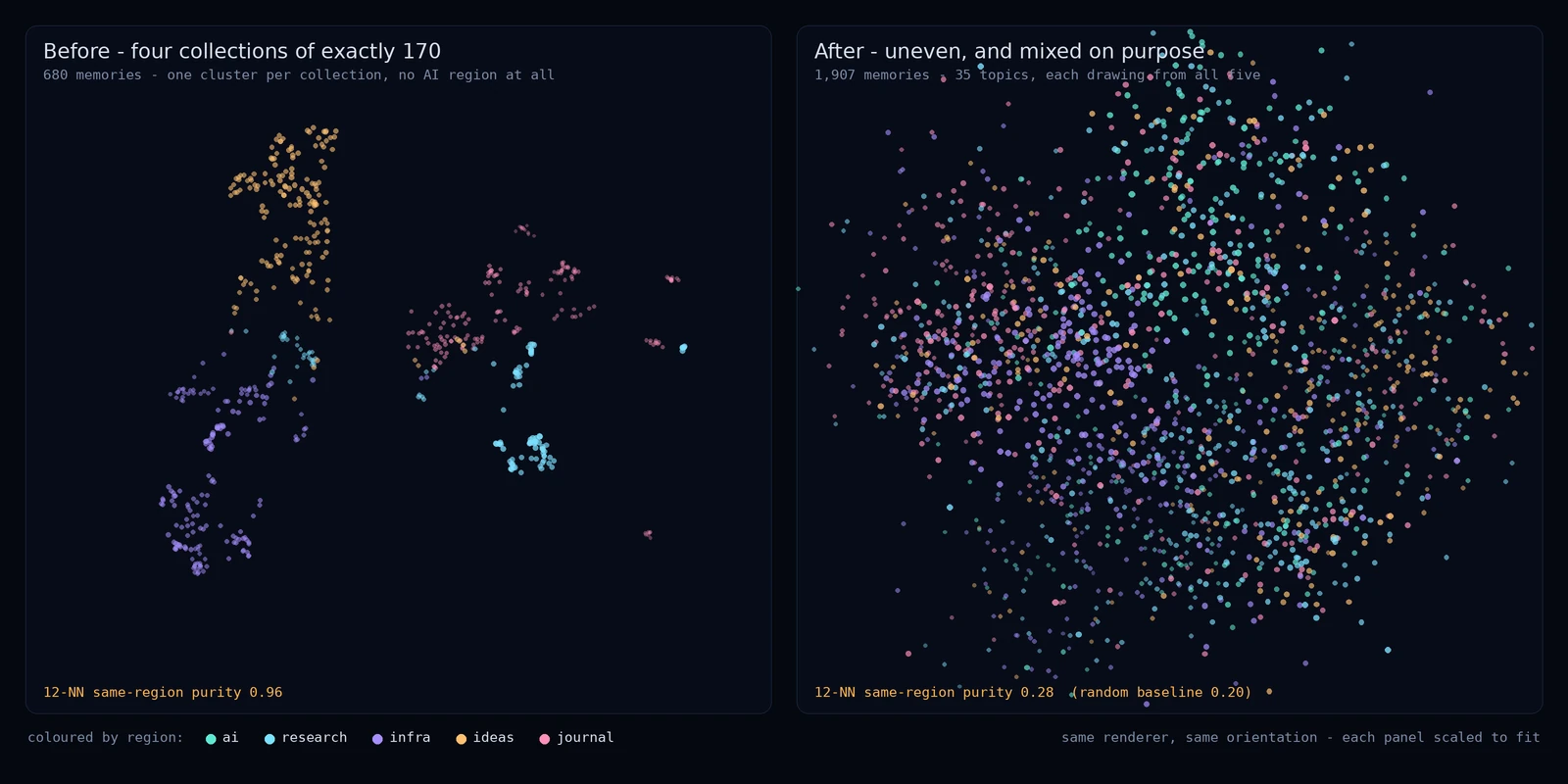
This week I opened the demo with fresh eyes and noticed something embarrassing. The four collections it was pretending to have (research, infra, ideas, journal) held exactly 170 notes each. And they sat in four tidy, well-separated, single-coloured clumps.
No real memory store has ever looked like that. And yet that is exactly the picture the internet has settled on. The knowledge-graph screenshots that do the rounds, the Obsidian vault posted as proof of a well-ordered mind, the neat little constellations in product launch videos: symmetric, evenly spaced, one colour per folder, every node comfortably visible. They are beautiful, and they are beautiful for the same reason a stock photo of a desk is beautiful. Somebody arranged them.

What a machine actually remembers is lopsided. A handful of subjects eat most of the space, half the notes are near-duplicates of a neighbour, whole regions overlap because a note about quantising an embedding model genuinely belongs to three topics at once, and the freshest thoughts sit in a bright clump because that is what this month happened to be about. The interesting picture is the messy one. My generator had produced the stock photo.
This matters more than it looks. The whole point of the demo is to give a stranger an intuition for the shape of a machine’s memory. If the shape is visibly manufactured, every claim resting on it gets quietly discounted. A visitor doesn’t need to run statistics to feel it. Four equal piles in four corners reads as someone typed a for-loop, and from that moment the map is decoration rather than evidence.
So the interesting engineering problem stopped being “draw it faster” and became: how do you fake something honestly? Not to deceive, since the page says “synthetic demo” in the header and again in the footer, but so the fake is a fair portrait of the real thing, structurally rather than in its contents.
What a real store actually looks like
Two properties, and my generator violated both.
Real collections are lopsided. A journal you write in most days grows without asking permission. A folder of side-project ideas gets a burst in January and then nothing. Sizes drift apart by factors, not by rounding errors. Four counts landing on the same number is not unlikely, it’s impossible.
Real topics don’t respect your folders. This is the deeper one. I had modelled collections as places, one region of space each, when they are really labels. A note reading “the backup job now also snapshots the vector index” belongs to infrastructure and to retrieval research at the same time. In a projection built from meaning, it lands between the two neighbourhoods, and it drags its neighbours’ colours with it. Real maps are marbled. Mine was striped.
The fix was to invert the generator. Instead of “pick a collection, then place it in that collection’s blob”, it now works topic-first. Thirty-five topics (embeddings, quantization, backup and DR, daily log, retros, thirty more) are laid out on a manifold at two scales: clusters of topics, and topics within clusters. Each topic then draws its members from every collection, with a dominant flavour and a genuine minority of the rest. Ideas about visualisation are mostly ideas, but a quarter of them are research notes and a few are journal entries, because that is how a week actually goes.
Measuring messiness
Here is the part I’d defend hardest: I did not eyeball it. If you can’t measure the tell, you will reintroduce it on the next pass.
The metric is simple. For each memory, look at its twelve nearest neighbours in 3D and ask what fraction share its collection. Average over the map. Call it same-region purity.
- 1.0 means perfect segregation, every point surrounded exclusively by its own kind. Blobs.
- The random baseline is whatever you’d get by shuffling the labels while keeping the positions. With these collection sizes, that’s 0.20.
The old hand-made map scored 0.96. Essentially the worst possible answer: barely distinguishable from four disconnected clouds.
The rebuilt one scores 0.28. Above the 0.20 floor, which is what you want, because there is real local structure: neighbourhoods do lean one way or another, and a note about certificates really does sit near other infra notes. But nowhere near segregated. You can no longer guess a memory’s collection from where it sits, only bet on it.
The hole I had not noticed
Then a second, more embarrassing gap. This is a demo about an AI’s memory, and it contained nothing about AI. Type “llm” into the search box and you got zero results. Same for “gemma”, “qwen”, “mistral”, “vram”, “cuda”. The invented notes were all infrastructure, retrieval method and journal entries, because those were the topics I happened to enumerate first.
That is a credibility hole of a different kind from the tidy blobs, and arguably worse: not a statistical tell, just an absence exactly where a curious visitor looks first. So there is now a fifth region, ai, with 347 memories about models, weights, GPU budgets, inference engines, context windows, fine-tuning, prompting, hallucination and attention internals. “llm” returns 269 matches. Every one of the terms above returns something.
Two details made it worth the effort rather than a keyword dump. First, the ai region is spread through the map like the others (12-nearest-neighbour purity 0.27 against the 0.20 floor), so searching “llm” lights up points in the infra and research neighbourhoods too, which is the honest picture: half of running a model locally is infrastructure work. Second, the model vocabulary is split by role. An earlier pass generated “swapped to bge-m3: better at instructions”, and bge-m3 is an embedding model, it does not follow instructions. Chat models, embedding models and vision-language models now come from separate pools and only appear in sentences where they make sense. The audience for this demo is exactly the people who would notice.
Two smaller tells
The search results list was showing the same invented sentence five times over, because a hundred-odd sentence templates spread across two thousand notes repeat every fifteenth note, and a results panel puts those repeats side by side. Previews are now composed from templates plus openers and closers, with global uniqueness enforced, so no two of the 1,907 notes read alike.
And a handful of very long links were crossing the entire frame. Technically valid associations, visually indistinguishable from a rendering bug. Link length is now bounded, and the longest 6% were simply dropped.
The whole generator is one deterministic script with a fixed seed: same input, byte-identical output, and the map in the repo can be reproduced and diffed. Fake data deserves the same reproducibility discipline as real data, arguably more, because nobody can check it against reality.
Reading it in ten seconds
Half the work was data honesty. The other half was a stranger’s first ten seconds.
Colour is age, and I nearly got this wrong. There were two palettes in the source I was drawing from. One assigns a colour per collection. The other walks the stellar O-B-A-F-G-K-M sequence, the real spectral classification astronomers use, from hot blue through white and yellow to cool red. I had assumed the first was the one that mattered. It isn’t: the stars themselves are painted by age along the stellar path, and the per-collection palette feeds the interface around them rather than the map. Fresh memories burn blue like young stars; two-year-old ones sit at the red end and are still there.
That turned out to be the right choice for a second reason. Once the collections are properly marbled through each other, colouring by collection would produce confetti: five hues sprayed everywhere, no readable structure. Colouring by age gives a coherent gradient across a mixed cloud, and it encodes something a visitor actually wants to know. So regions were demoted from a colour channel to a filter. Click “infra” and everything else dims. You learn the structure by asking for it, instead of being shown all five answers at once.
Position is meaning, which is the part that carries over unchanged from the original write-up and from the geometry of meaning: similarity becomes distance. Worth being precise about what is real here, though. Done properly, positions come from embedding every note and projecting the result down to three dimensions. In this demo, no model runs at all. The generator fabricates a layout with the statistical texture a projection would produce. The geometry is a portrait of a process, not its output. Saying so plainly costs nothing and is the difference between a demo and a claim.
And nobody clicks the help button. The demo used to open on two thousand unexplained dots with a “?” in the corner, an explanation available on request, which is restraint that quietly functions as a design failure. A visitor arriving from a link is not looking for documentation; they are deciding, in a couple of seconds, whether this is worth a third one. So the explanation now comes to them: a six-beat guided tour that moves the camera and says one thing per beat, skippable at any point, and remembered locally so a returning visitor is left alone. Explaining the map turned out to be a bigger improvement than anything I did to the map.
The metric, turned into a button
The purity number needed every memory’s twelve nearest neighbours. Having computed that to audit the map, it seemed perverse not to let the visitor ask the same question.
So clicking a point now pins it and fills a panel with the six nearest memories in the cloud, with amber dashed lines drawn out to them. On a deliberate click, not on hover, which would only flicker.
The part worth explaining is that this needs no backend. The obvious way to build it is to re-embed the selected note and run a fresh vector search. There is nothing here to run that against, and that turns out not to matter, because the coordinates already are the projection of the embeddings. The six closest points in the cloud are the six most similar notes, by construction, not by approximation. It costs one brute-force pass over 1,907 squared distances, once per click and never per frame.
It also makes this article’s own claim checkable on screen. The amber lines and the cyan ones only partly overlap. Cyan is an association somebody declared; amber is the geometry itself. Where the two disagree, the map is telling you that meaning went somewhere the links did not follow.
Making it free to draw
Which leaves the rendering. There are now 1,907 glowing points and 2,915 lines, additively blended, and the target was a demo that stays smooth on a modest laptop and a phone.
The first decision was to stop at 30 frames per second. The camera only ever drifts slowly; the extra thirty frames bought nothing anyone could see and cost every weak GPU half its budget.
The second was to make each point cheap. Drawing two thousand circles per frame means two thousand rounds of set a colour, begin a path, arc, fill, and the state changes are the expensive part. Instead the renderer pre-bakes 120 little sprites: 24 stellar colours times 5 depth brightnesses, each a radial gradient with its brightness already multiplied in. The hot loop then becomes one drawImage per point, with a sprite switch only when the colour or the depth band changes. Getting the paint order right without sorting two thousand items every frame is a counting sort on (depth bucket, colour): one linear pass, and iterating the buckets in order paints the field back to front. Instrumenting the real thing gives about 1,900 draws and 300 sprite switches per frame, so roughly one state change per six points instead of one per point. Additive blending over a near-black background does the rest, and overlapping stars bloom into each other, which is why dense neighbourhoods glow.
The third is the one worth stealing, and I borrowed it from a sibling demo: the canvas parks at rest. When nothing is moving, no idle orbit, no drag, no camera flight, no hover, the render loop does nothing. Zero work, zero GPU, and the last painted frame simply stays on screen, which is indistinguishable from a canvas being redrawn identically thirty times a second. The idle rotation runs for thirty seconds after you last touched it and then stops. An IntersectionObserver parks it when you scroll away; the browser already parks it when the tab is hidden.
The cheapest frame is the one you never draw. It is a strange thing to have to rediscover, because the default mental model of animation is a loop that always runs, and most of what a page like this displays is static most of the time.
The rest is unglamorous hygiene. Points that fall off-screen or below a pixel are skipped, lines with both endpoints off the same edge are skipped, device pixel ratio is capped at 1.35 because doubling device pixels quadruples fill cost, and a governor degrades quality in order of least visual harm if a frame ever exceeds 14 ms: thin the web, then simplify it, then drop the farthest and already dimmest depth shells. Also: no backdrop-filter, no shadowBlur, anywhere. Both look lovely in a mockup and both force the GPU to re-blur a moving canvas every frame.
The result, measured with software rasterisation so the numbers are pessimistic rather than flattering: about 2 ms of work per frame at 1600x900, about the same at 2560x1440, slightly less on a phone-sized viewport, and zero draw calls once you stop touching it.
What the honesty buys
The privacy boundary on this demo isn’t a login bolted to the front. It’s that there is nothing real inside it: no vector database, no embedding model, no backend at all. The server hands out a dozen static files from an allowlist and the search runs in your browser. You cannot exfiltrate a memory store from a page that has never held one.
The paradox I like is that protecting the real thing required making the fake messier. A tidy fake is a worse portrait and, in a quiet way, a less honest one: it implies a machine’s memory is neatly filed by category, when the whole reason a map is worth drawing is that meaning refuses to stay in the folders you gave it.
Go have a look: cortex-demo.akciali.com. Drag to orbit it, click any point to read the note and watch its six nearest neighbours light up, search for “llm” and see the matches land in three different neighbourhoods at once. And if you want to see the structure that the mixing is hiding, click a region in the legend and watch four fifths of the sky go quiet.
Further reading
- UMAP: Uniform Manifold Approximation and Projection for Dimension Reduction (McInnes, Healy, Melville, 2018), the projection method whose statistical texture the generator imitates: arXiv
- Stellar classification, the O-B-A-F-G-K-M temperature sequence the age palette borrows, and the Hertzsprung-Russell diagram it comes from: Wikipedia
globalCompositeOperationon MDN, the additive-blending mode that makes overlapping stars bloom instead of overwrite: MDN- Earlier in this series: Inside the Cortex for how the real map is built, The Geometry of Meaning for why distance means similarity, and The Map in Your Head for why your brain files ideas the way it files places.