Inside the Mesh: a live map of a self-hosted lab
A home lab as a living health map, and the public demo it became: a fictional Kubernetes platform where an agent proposes the fix and you approve it. What's real, what's replayed, and how it's built with zero dependencies.
Start here: a lab you can watch breathe
Open the demo, mesh-demo.akciali.com, and you are looking at a light, force-directed map of a Kubernetes platform: cluster nodes, control plane, GitOps, observability, data stores and AI workloads. Colour is health: green ready, amber degraded, red down. An event stream scrolls down the right-hand side, three alerts are waiting, and each comes with a fix an agent has already drafted; nothing runs until you approve it. Human in the loop, as a clickable toy.
What you’re clicking is a synthetic showcase: a fictional cluster, replayed events, scripted incidents; nothing talks to real infrastructure. This article tells the story of the original, private version of the map: the same idea pointed at my actual home lab, with real health and real events.
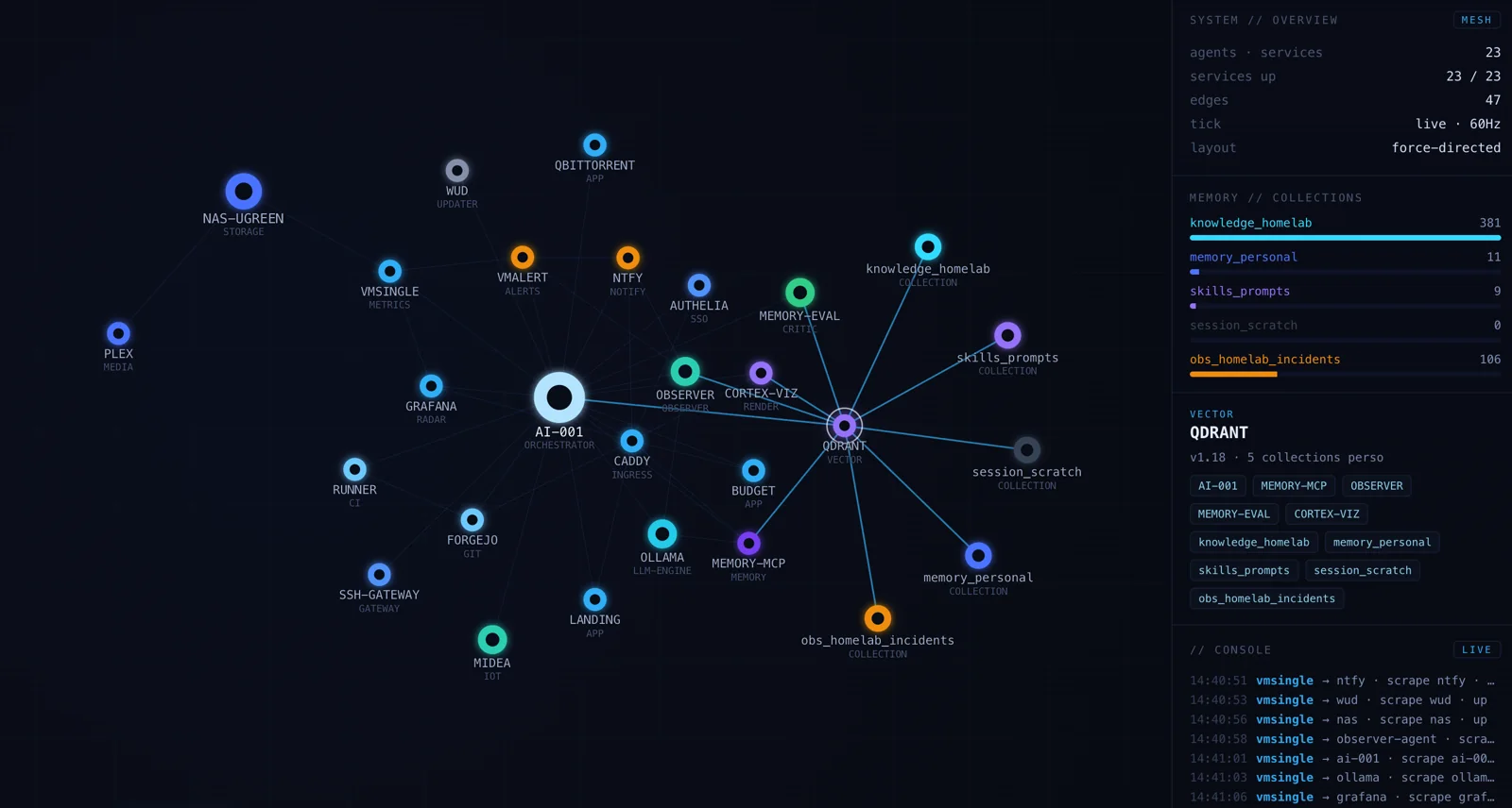
You don’t need to know what any of these boxes do to get the idea. The shape tells the story: one machine at the centre doing the orchestrating, clusters of services around it, and the whole thing reacting in real time when something goes down or recovers.
The nodes are the lab
Every node is a real piece of the lab. At the centre sits the compute host that runs the rest. Around it are the agents, the things that do work on a schedule: the one that writes a daily status digest, the local model server, the climate agent that watches the flat. Then the services: the reverse proxy and single sign-on out front, the Git server and its CI runner, the metrics stack, the vector database, the push-notification bus, the budget app, this very website. Off to one side, the NAS. And finally five memory collections, the buckets where an AI assistant keeps what it has learned.
That’s 28 nodes and 47 edges. The panel on the right counts how many services are up and shows the live size of each memory collection, straight from the database.
The honest part: what’s real and what’s just pretty
A visualization like this is trivial to fake: sprinkle some random pulses on a graph and it looks alive. (Today’s public demo is, deliberately, one hundred percent replay; it says so on the page.) For the private map this article is about, here was the split.
Real and live: the nodes themselves (declared from the lab’s actual topology), the health of every service, the down-and-recovered transitions, the sizes of the memory collections, and the event console, a read-only subscription to the lab’s alert and digest bus. When a service falls over, its node turns red here for the same reason my phone buzzes: the metric said so.
Cosmetic: the “messages per second” counter and the little packets gliding along the edges. They’re ambience. They make the graph feel like it’s breathing, but they don’t carry data, and I’d rather say so than let a pretty animation pose as telemetry.
The rule I set myself building this: if a number is on screen, it should be true. The drifting packets are the only thing allowed to be theatre.
How the health is real
The graph doesn’t keep its own private idea of what’s healthy. It reads from the same place my dashboards do: the metrics store that scrapes every container. A node goes red when its system unit is down or a probe fails, and turns back when the metric flips. The collection bars are the vector database’s own point counts. The console is a read-only feed off the alert bus. Nothing here is a second, hand-maintained version of the truth that could quietly drift from reality: it’s the lab describing itself.
Built to depend on nothing
Two small files, and neither one pulls in a framework.
The front end is a single HTML file. The graph is a hand-written force-directed simulation on a 2D canvas (repulsion pushing nodes apart, springs pulling connected ones together, a little gravity to keep the whole thing centred), finished with a neon glow. No charting library, no framework, zero dependencies.
The back end is an equally dependency-free Node server: just the standard library. It serves the page, a health check, and a live stream. In live mode it queries the metrics store and the vector database and pushes typed events down that stream as they change.
And it runs in two modes, neither of which costs a cent in API fees: Snapshot (open the file offline, topology baked in, console simulated) and Live, where you run the server and real health, counts and events stream in, and the UPLINK badge flips to a steady green.
It’s the first room of a bigger house
The Mesh is the first app of a personal “agentic OS”, one shell meant to gather the pieces I’ve already built into a single place. The idea borrows from the agentic-OS pattern doing the rounds (a conductor wiring together domains and primitives) but pointed at real infrastructure, and deliberately built to run under a flat subscription instead of metered API calls.
The shell already has more rooms than the map: a live Briefing (what’s up, what deployed today, a few sparklines), a GitOps view of the CI pipeline and its real runs, an SLO view for uptime, latency and certificates, and a Cortex tab, which embeds the 3D memory map I wrote about in Inside the Cortex. The Mesh stays the ops view; Cortex stays the memory view; they live side by side.
One boundary is deliberate: my day-job context is left out entirely. This is the personal lab, and only the personal lab.
Why bother
A list of containers in a terminal tells you what is running. It doesn’t give you a feel for the lab as a living system. Watching it as a graph does: the orchestrator at the centre, the clusters around it, the one node that just went red, the events rippling down the side. It turned a pile of system units into something I have intuitions about.
Like the Cortex map, it began as a “wouldn’t it be fun” on a quiet evening. It quietly became the first thing I open when I want to know, at a glance, that the lab is fine.
The private map has since folded back into the lab’s dashboards; what lives online is the synthetic showcase. Have a look: mesh-demo.akciali.com: pick an alert, read the agent’s plan, and approve the fix yourself.